simple
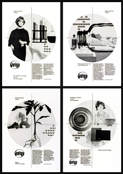
23 03 2009while working on my own informational design, i have noticed that the simplest design is what stands out for me. very clean lines, good use of negative space, not too much color….
here are four different pages that i felt would be good lay outs for and information design piece..
Comments : Leave a Comment »
Tags: information design, simple
Categories : design, inspiration, looking, typography
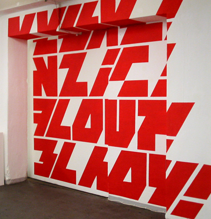
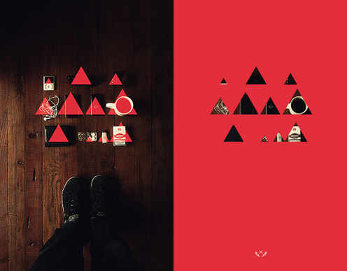
type SPACE AND TEXTURE
12 02 2009



Comments : Leave a Comment »
Tags: space, texture, type
Categories : design, inspiration, looking, typography
logoTYPE
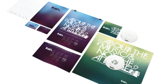
12 02 2009Also on OBT Design‘s website I really enjoyed their logotype designs. They were very playful and looked like a lot of fun to design!



Comments : Leave a Comment »
Categories : design, inspiration, typography
cleeean
12 02 2009
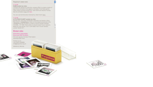
In class this week our “digital weekly” assignment was WHITE SPACE (or negative space) which got me to realize when designing a website with a lot of information, it could be really difficult to not get cluttered. So while searching the web I began to appreciate the clean web sites that took advantage of negative space. One site I enjoyed looking through (and one that kept my attention and time) was OBT Design‘s web site (above image of home page). Very clear to the point, easy navigation, and no clutter!
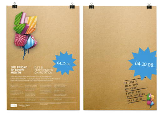
This good use of negative space also carried through in there work…..

Comments : Leave a Comment »
Tags: clean, negative space, OBT, white space
Categories : design, inspiration, looking
whole lota’
2 12 2008Comments : Leave a Comment »
Tags: looking, notcot, web
Categories : design, inspiration, looking, web
WINDOW INSTALLATIONS
2 12 2008Comments : Leave a Comment »
Tags: inspiration, installation, looking
Categories : advertisement, design, fashion, inspiration, looking
FACE 31
2 12 2008Comments : Leave a Comment »
Tags: design, face 31, looking, typography
Categories : design, looking, typography
PEEPSHOW
19 10 2008Great website! LOTS and LOTS to look at!
Go to PEEPSHOW, then click on “ENTER SITE”….
From there you will see plenty to look at.
I really enjoyed looking at the animations, some of them are in the simplest form and still get the point across, others are more abstract and create some beautiful compositions.
Over all just a really interesting site how the user navigates through the pages. I really like the idea of using the slides as different categories and pages. Very creative.
Comments : Leave a Comment »
Tags: animation, design, illustration, peepshow, website
Categories : design, illustration, inspiration, looking, web


